DESIGN BRIEF
Create an identity that reflects MoreScope's youth and flexibility, their vision, mission and values, while still maintaining their seriousness and focus on scientific integrity.
Create a distinct and recognizable identity that separates us from a broad competitive landscape, and that works well in both Norway and the rest of Europe, as well as in the U.S.
The company would like a new name which doesn't limit their opportunities for expansion, and that works well in both Norwegian and English. The name should be short and intuitive to pronounce and spell.
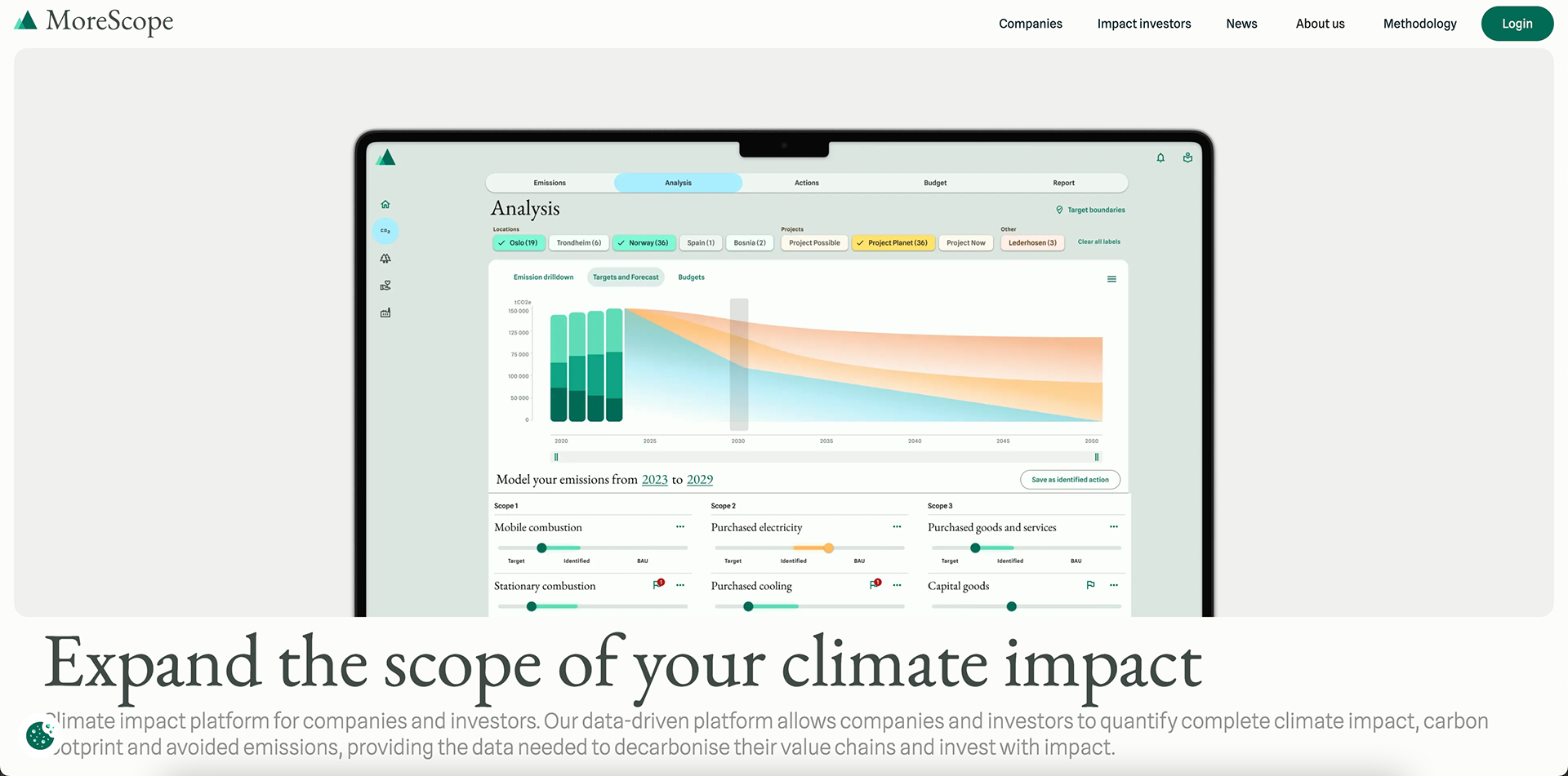
EXISTING SOLUTION

Website – desktop

Website – mobile
ID CARDS
BUSINESS CARDS
WEBSITE
NAME CHANGE
The name Enivio was chosen because of its lack of direct associations, intuitive spelling and pronunciation, as well as its gender-neutrality. The name itself doesn't mean anything in any language, which was important to avoid potential misunderstandings and language barriers.
When asked what people think of when they hear the name Enivio, people said it reminded them of the word "environment", "green" or environmentally friendly, and professionalism.
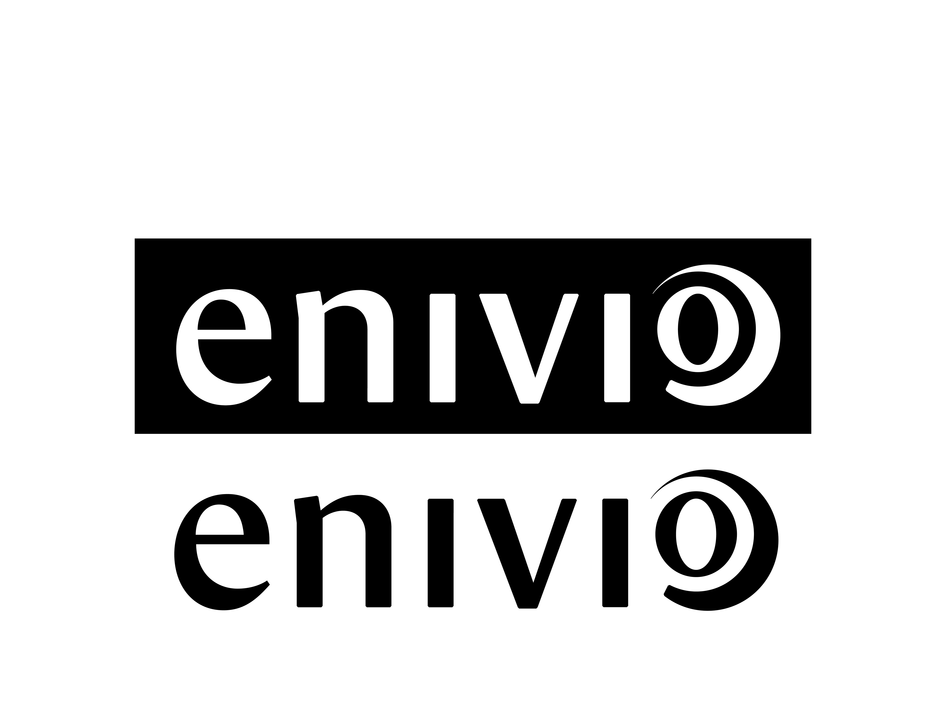
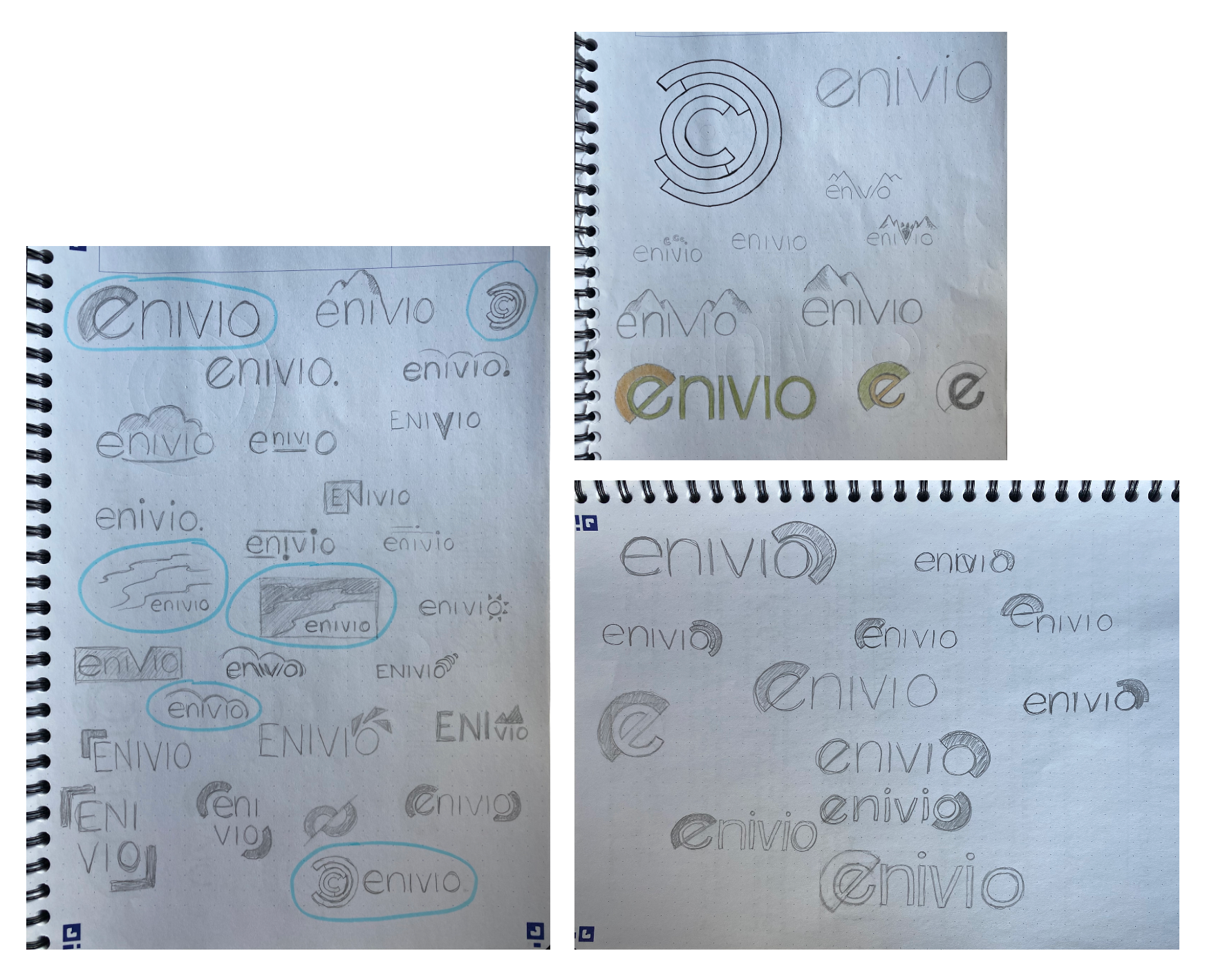
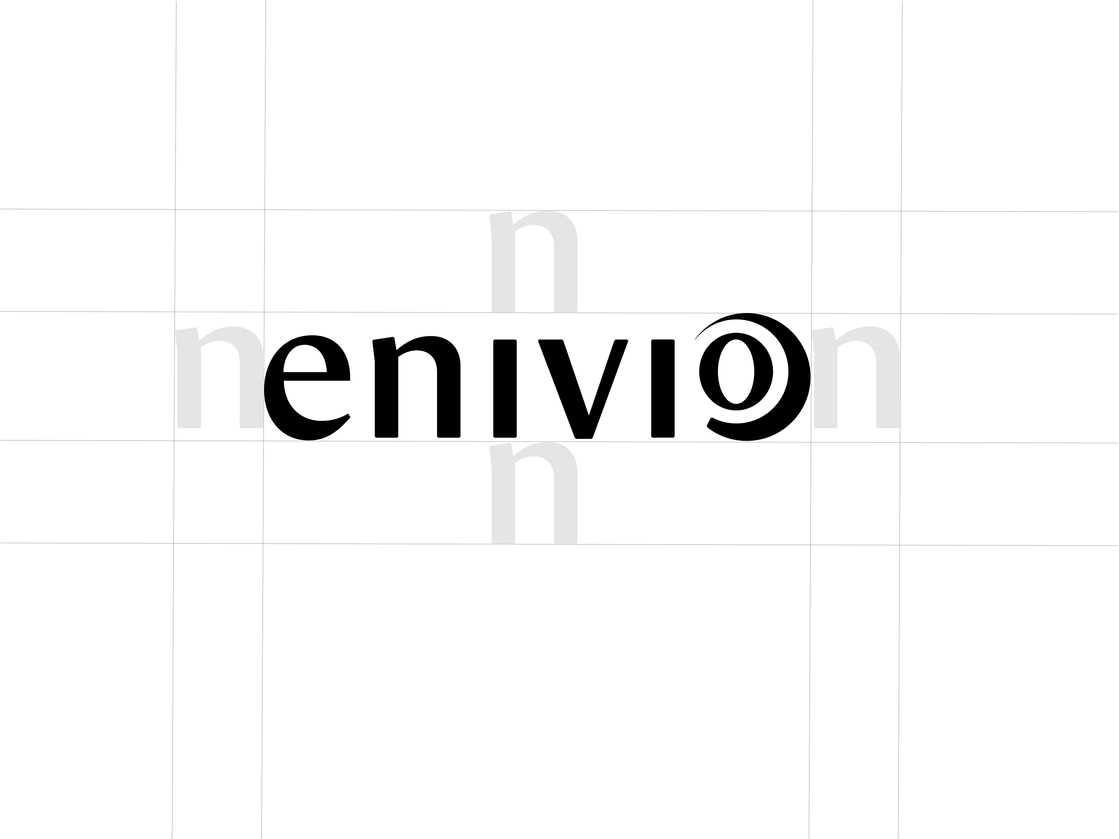
The logo is a custom designed font based on the existing font "Le Monde Journal STD". I wanted to use a smooth, soft, sans-serif font for this logo to make it seem professional, modern, and friendly. I also wanted a bold, clean look, while still keeping the logo looking young and playful.
The graphic element is designed off of a circular graph, which gives associations to accounting and mathematics, while still implementing a natural bent shape which is found in almost every natural element that exists. The "O" in the name Enivio is minimized and raised to give the overall put-together look, and the "O" can look like either a percentage symbol or a celcius symbol, giving associations to both accounting, mathematics, and climate.


DESIGN SPECIFICATIONS
I chose to use shades of blue as the primary color palette for Enivio's rebrand. I also use a photo of a glacier for many of the graphic elements in my design.
This particular photo, while of a glacier, contains many abstract shapes which gives associations to several natural elements such as water, ice, and wind. Glaciers are also a recognizable part of Norwegian nature, and communicates Enivio's Norwegian identity and roots.
As for my secondary colors I chose a sandy beige color and a warm orange/beige which compliments the blue shades well and adds a bit of warmth to the design.
MOCKUPS